
Every year, the Pantone Colour of the Year sets the tone for design industries worldwide. From fashion to packaging and, of course, interior spaces, Pantone’s picks reflect cultural moods and emerging trends. Over the past decade, these shades have inspired new home decor trends that reflect our lifestyles and self-expression.
If you want to refresh a space or choose paint colours that resonate emotionally, explore the Pantone Colours of the Year from the past decade for inspiration.
Pantone Colour of the Year (2015-2025)
2015 – Marsala (Pantone 18-1438)
HEX: #964F4C
Marsala is a warm, earthy red that exudes confidence and depth. Think of it as grounded luxury. In the home, it works beautifully as an accent wall, velvet throw pillows, or even a front door that makes a bold but tasteful statement. It pairs well with warm neutrals and adds a touch of global sophistication to boho or rustic decor.
2016 – Rose Quartz (13-1520) & Serenity (15-3919)
HEX: #F7CAC9 (Rose Quartz), #91A8D0 (Serenity)
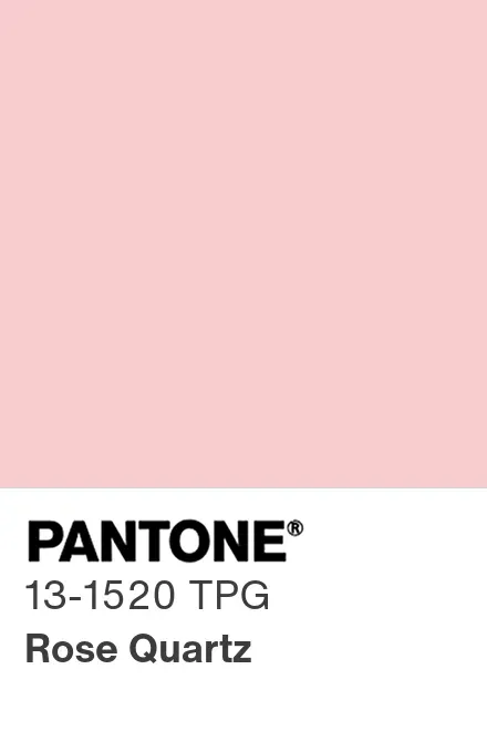
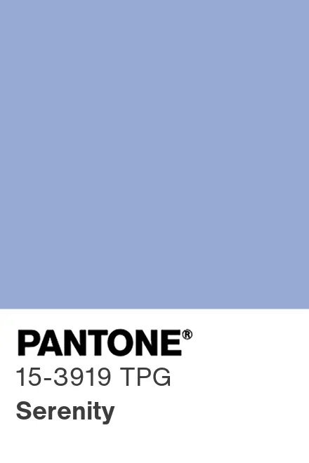
This was the first time Pantone named two shades, symbolizing harmony and gender fluidity. Rose Quartz’s soft pink and Serenity’s periwinkle-blue offered a spa-like palette perfect for bedrooms or nurseries. Together, they evoke balance and softness—ideal for wellness-inspired interiors.
2017 – Greenery (15-0343)
HEX: #88B04B

This zesty yellow-green shade was a literal breath of fresh air. Meant to signal renewal and reconnection with nature, Greenery worked its magic in sunrooms, kitchens, and anywhere houseplants thrive. It brought sustainability and natural vibes into sharp focus, aligning with rising eco-conscious home decor trends.
2018 – Ultra Violet (18-3838)
HEX: #5F4B8B
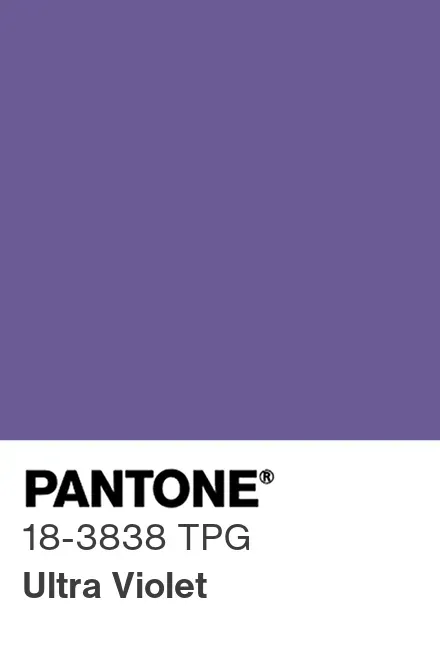
Mystical and imaginative, Ultra Violet channelled the cosmos and creative thinking. This deep purple was dramatic and best used in small doses—think accent chairs, velvet throws, or moody powder rooms. For interiors, it created a rich, introspective ambiance when paired with metallics or jewel tones.
2019 – Living Coral (16-1546)
HEX: #FF6F61

This vibrant yet mellow coral offered warmth and playful energy. It was a hit in coastal-inspired spaces and bohemian rooms needing a sunny lift. Use Living Coral in patterned textiles, wall art, or kitchen accessories to spark joy without overwhelming a space.
2020 – Classic Blue (19-4052)
HEX: #0F4C81

A timeless navy with a grounding presence, Classic Blue offered reassurance in uncertain times. It was ideal for creating serene home offices or sophisticated living rooms. Pair it with white trim for crisp contrast, or layer with soft neutrals for depth and calm.
2021 – Ultimate Gray (17-5104) & Illuminating (13-0647)
HEX: #939597 (Gray), #F5DF4D (Yellow)
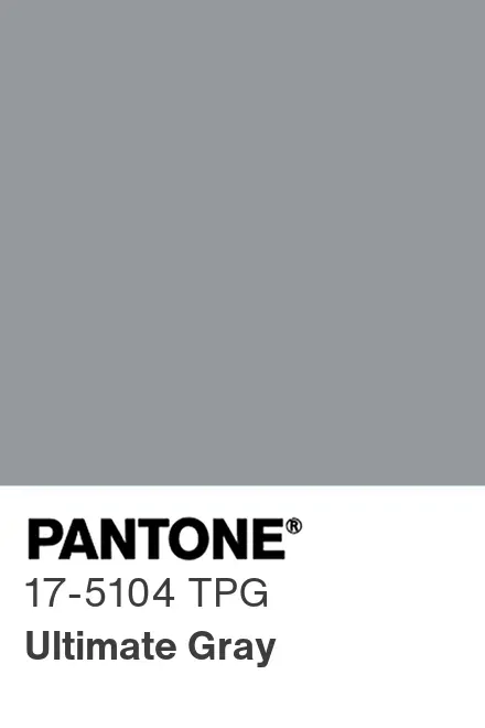

Symbolizing resilience and hope, this pairing was a direct response to the global pandemic. Ultimate Gray brought stability, while Illuminating infused optimism. Gray served as a versatile base, and yellow worked well in entryways or accents like lamps and linens—great for staging a cheerful, welcoming home.
2022 – Veri Peri (17-3938)
HEX: #6667AB
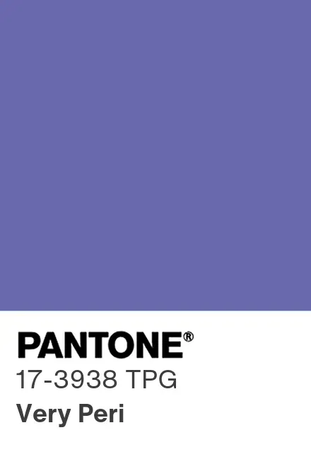
A periwinkle with a hint of violet-red, Very Peri represented innovation and creativity. It was perfect for energizing creative workspaces or adding a pop of unexpected colour to neutral rooms. Consider it for modern art pieces, painted cabinetry, or playful tile backsplashes.
2023 – Viva Magenta (18-1750)
HEX: #BB2649
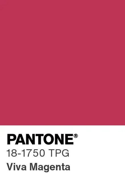
Vibrant and rebellious, Viva Magenta radiated strength and fearlessness. It made a bold choice for statement furniture or dining room walls. Use it where you want drama and flair—just balance it with lighter tones to avoid overwhelming the space.
2024 – Peach Fuzz (13-1023)
HEX: #FFBE98
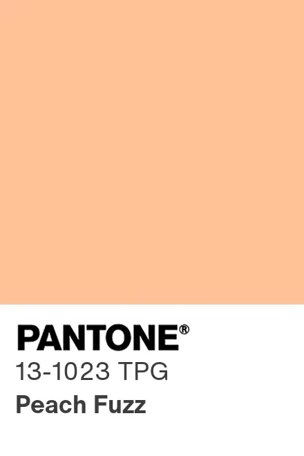
Soft, velvety, and nurturing, Peach Fuzz marked a return to tenderness and warmth. Ideal for bedrooms, nurseries, or cozy reading nooks, this pastel hue blended well with creams, blushes, and earthy tones. It invited comfort, care, and slow living into the home.
2025 – Mocha Mousse (17-1230)
HEX: #A47764

This grounded, creamy brown captures a shift toward warmth and nature. Expect to see it in kitchens, living rooms, and even exterior trims. It’s a fresh alternative to gray and pairs beautifully with greenery, terracotta, and textured materials like rattan and linen.
What These Shades Say About the Decade
Over the past decade, the Pantone Colour of the Year trend has reflected our changing emotions and priorities. In the late 2010s, shades like Greenery, Ultra Violet, and Living Coral brought a sense of renewal and bold creativity. As we moved into the early 2020s, the focus shifted to comfort and calm, with colours such as Classic Blue, Ultimate Gray, and Peach Fuzz.
This shift shows how design trends have moved from energetic, lively spaces to ones that feel warm, soothing, and connected to nature. Colour psychology is a big part of this: calming shades like Serenity or Mocha Mousse are perfect for wellness areas, while vibrant tones like Viva Magenta add energy to social spaces or creative studios.
Bringing Pantone Home
Whether you’re staging a home or just want new design ideas, these colours can make your place feel current and personal. Looking at past Pantone Colour of the Year choices gives you plenty of decorating inspiration, from bold accent walls to subtle touches that boost a home’s appeal. The right colour can create an instant emotional connection when someone walks in.
Inspired by a decade of colour? Discover homes that offer the perfect canvas for your next design move on Zoocasa. Start your search today.